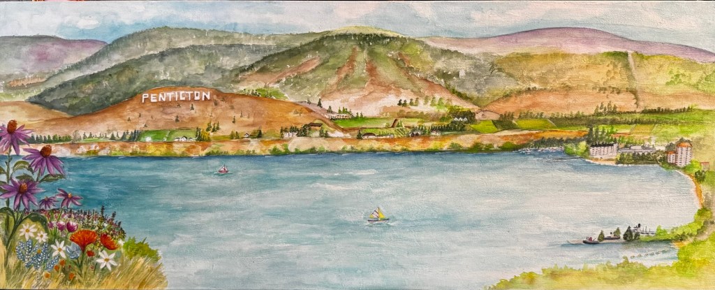
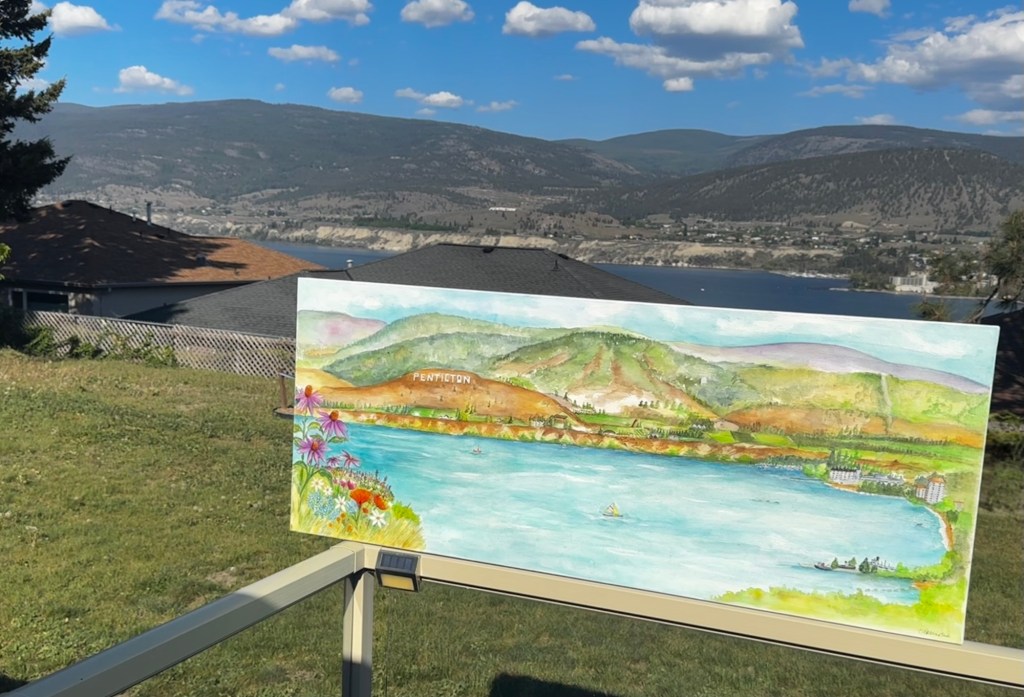
In 2025, I was commissioned to create a large-scale watercolour painting on a custom 5′ x 22″ canvas. I purchased a custom sized canvas from Opus Art Supply in Coquitlam. When I went to pick it up, the staff were instantly curious about what I was planning. Apparently a giant watercolour canvas isn’t something they see every day — and somehow, by the end of that visit, my Instagram account had picked up a bunch of new followers too.
Before a single brushstroke happened, I had to figure out one important thing: How exactly do you paint watercolour on canvas?
At first, I considered painting on paper and mounting it afterward, but after chatting with my watercolour bestie, he introduced me to the idea of using watercolour ground. I bought a giant jar and dove in headfirst, fully expecting a bit of chaos and experimentation along the way.
What I quickly learned was that everyone has a different opinion about using watercolour ground on canvas. Some artists love it, others absolutely hate it. For me? It worked beautifully. Since then, I’ve completed several more paintings on canvas and even have another large-scale piece currently in progress.
Prepping the surface became a project of its own. Layer after layer of watercolour ground, sanding between coats, dust everywhere — and finally a full spray-down to clean the surface before I could begin sketching. Only then did the real excitement start.
I’m definitely the kind of artist who needs to fully map out a composition before committing to a large piece. I’ll make smaller studies, test colour palettes, and work through ideas until everything feels right. That planning stage is honestly one of my favourite parts of the process.
Choosing the paints, however, nearly drove me crazy.
After a lot of back and forth, I settled on a combination of Qor and Rockwell Paints. Qor brings this incredible punch of vibrant colour, while Rockwell paints do something really special — the colours evolve as they move. You might lay down a green wash and suddenly notice warm oranges subtly emerging through it, creating unexpected depth and energy. Watching those colours interact felt a little bit magical.
One thing about the painting was non-negotiable though: the Penticton sign had to be included.
Perched above the city on Munson Mountain, the Penticton sign is an iconic part of the Okanagan Valley in British Columbia. It’s our own small-town version of the Hollywood sign, overlooking the lakes, vineyards, and rolling hills below. The sign has stood there for more than 80 years, and for locals and visitors alike, it’s instantly recognizable.
Ironically, the hardest part of the entire painting wasn’t the sign — it was the shoreline.
Trying to understand the distance, perspective, and shape of the landscape had me completely stuck for a while. So in July 2025, I went back up there with my drone and sent it high into the air to get a better view. The moment I saw the shoreline from above, everything finally clicked into place.
That’s one of the things I love most about creating art: sometimes the breakthrough comes only after you’re willing to look at something from an entirely different perspective.
My painting style has evolved after a trip to Mexico, I had learned from Terre Lojero, that you need to take creative license, bring colour into your paintings and create the experience. Sometimes we get caught up in replicating the real colour of what we see, and sometimes it works, but really there is more colour deep down in the scenery, and this becomes artist expression.


Leave a comment